FarmlandStats.com was live for several years before I decided to close the website in early 2025.
I continue to maintain over 30 live dashboards that pull data from sources such as the USDA and NOAA.
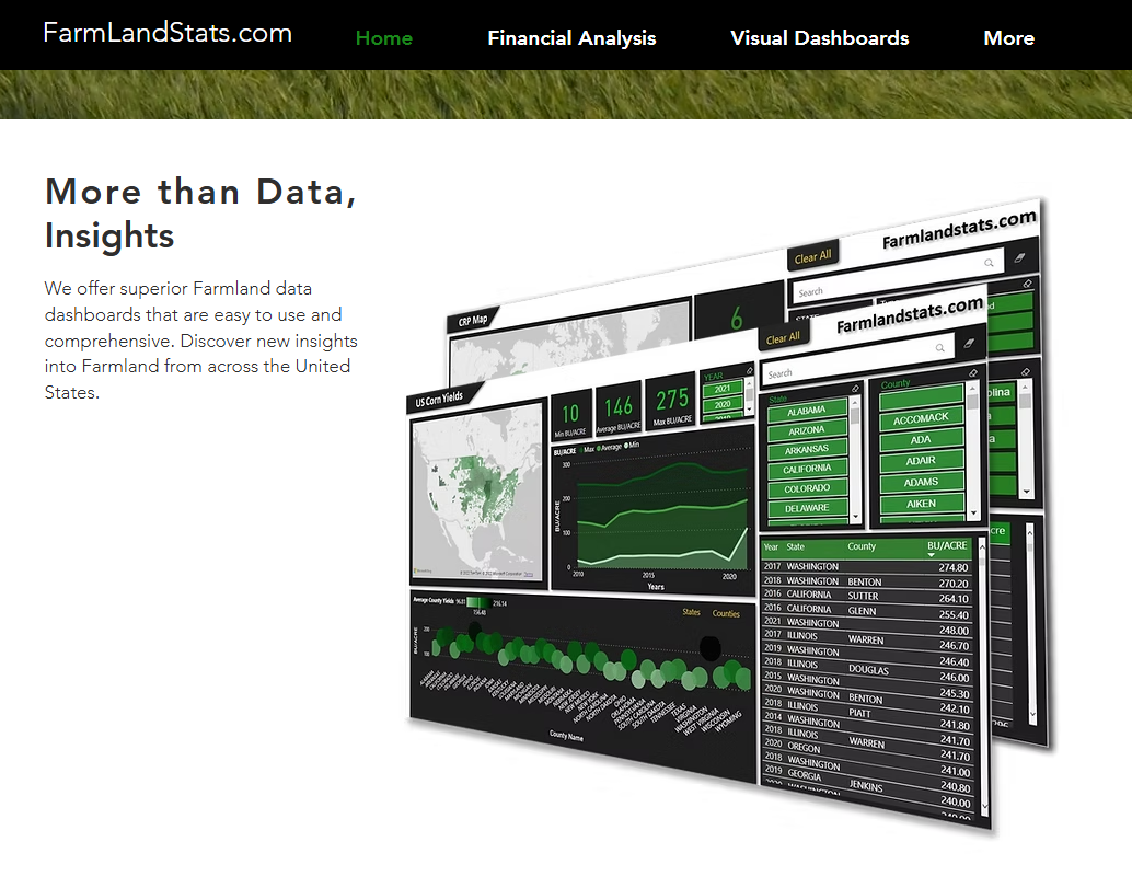
Below is Several examples showcasing my dashboarding, analytics, and creative design skills.
This interactive dashboard visualizes 10 years of precipitation data from NOAA weather stations across the US. Explore county-level rainfall trends and patterns using the embedded Power BI report below.

This federal Conservation program offers financial incentives to farmers and landowners to remove highly erodible land from agricultural production and plant it with grasses, trees, or other cover crops for conservation purposes.
Here is a dashboard of Average Property Taxes by county in the US
FarmlandStats.com was founded on the principle of asymmetrical market information—the idea that one party in a transaction often has access to better or more comprehensive data than the other. This concept, which also underpins platforms like Zillow, inspired me to make farmland data more transparent and accessible.
By providing insights such as average cost per acre, typical farm sizes, yield data, and rainfall by county, I aimed to empower investors and landowners to make more informed decisions. The goal was to help users understand farmland markets beyond their immediate experience, enabling fairer pricing and smarter investments.
However, a key challenge emerged: the high cost of farmland creates a significant barrier to entry. Unlike the stock market, where anyone can start investing with a small amount, farmland typically requires hundreds of thousands of dollars. This reality limits the potential user base to a small group of experienced professionals who already possess deep market knowledge.
In summary, while I believe strongly in the value of transparent data, the niche nature of the market and the high entry costs made it difficult to achieve sustainable growth or revenue at scale.
The dashboards and live data on FarmlandStats.com provided clear, insightful views into farmland trends across the country.
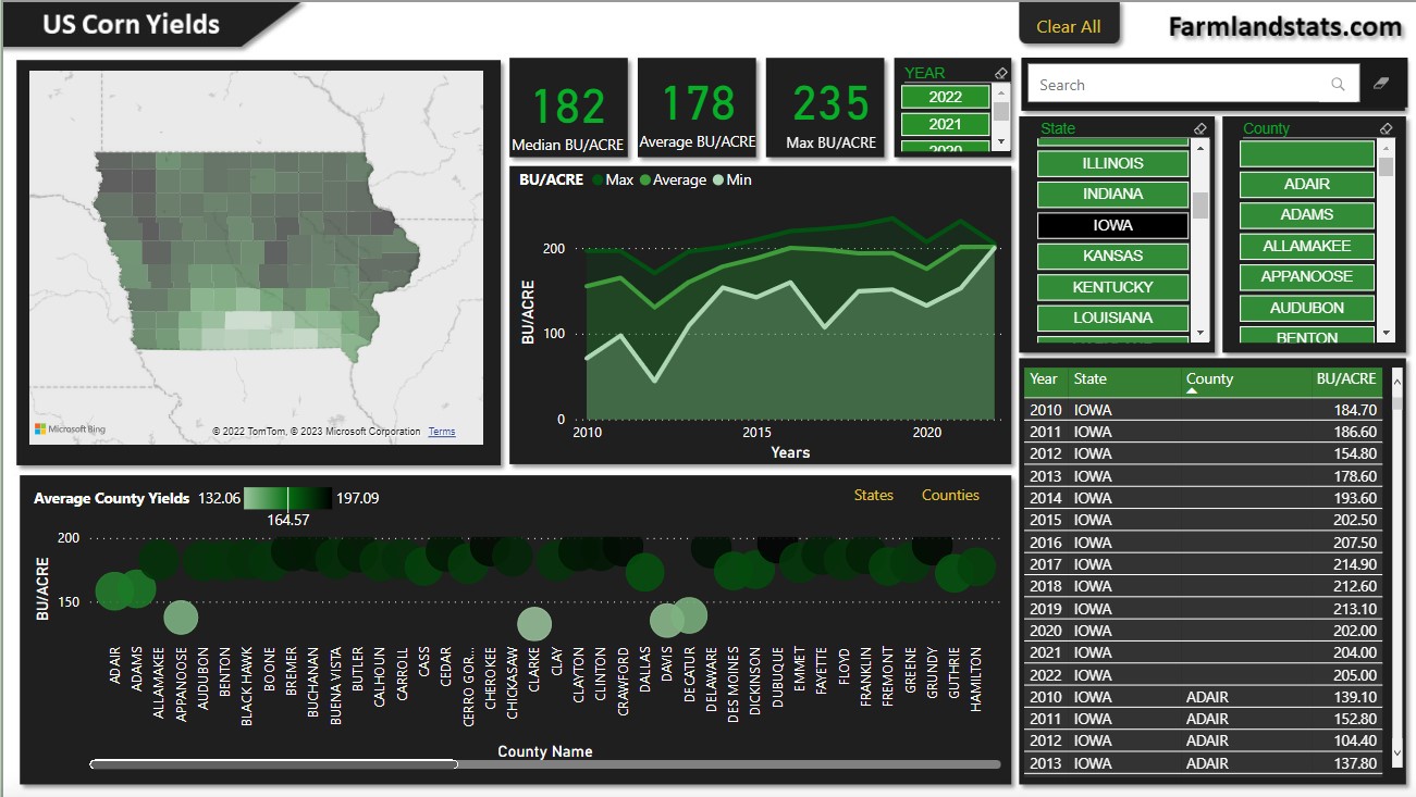
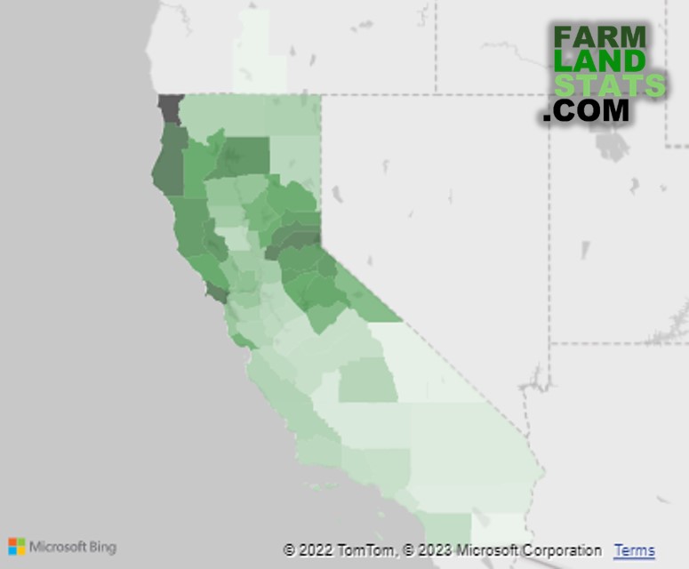
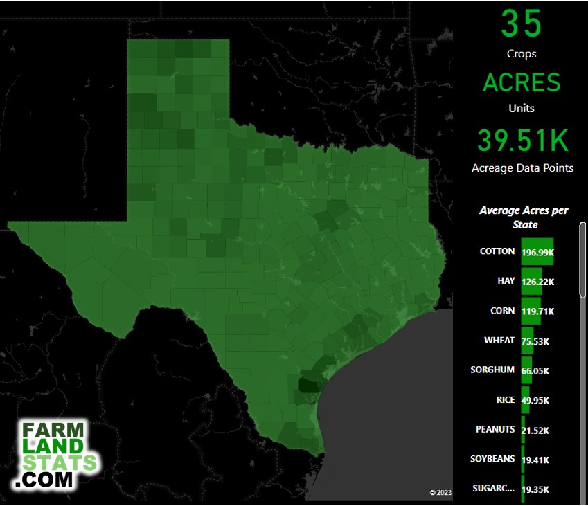
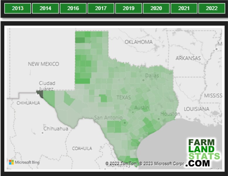
Effective data analytics relies on strong visualizations—especially maps and color gradients—to make complex information accessible.
Below are examples of dashboards and key charts I developed, including a tornado chart highlighting Texas crop data, county-level mapping, and a detailed Corn Yield report for Iowa.
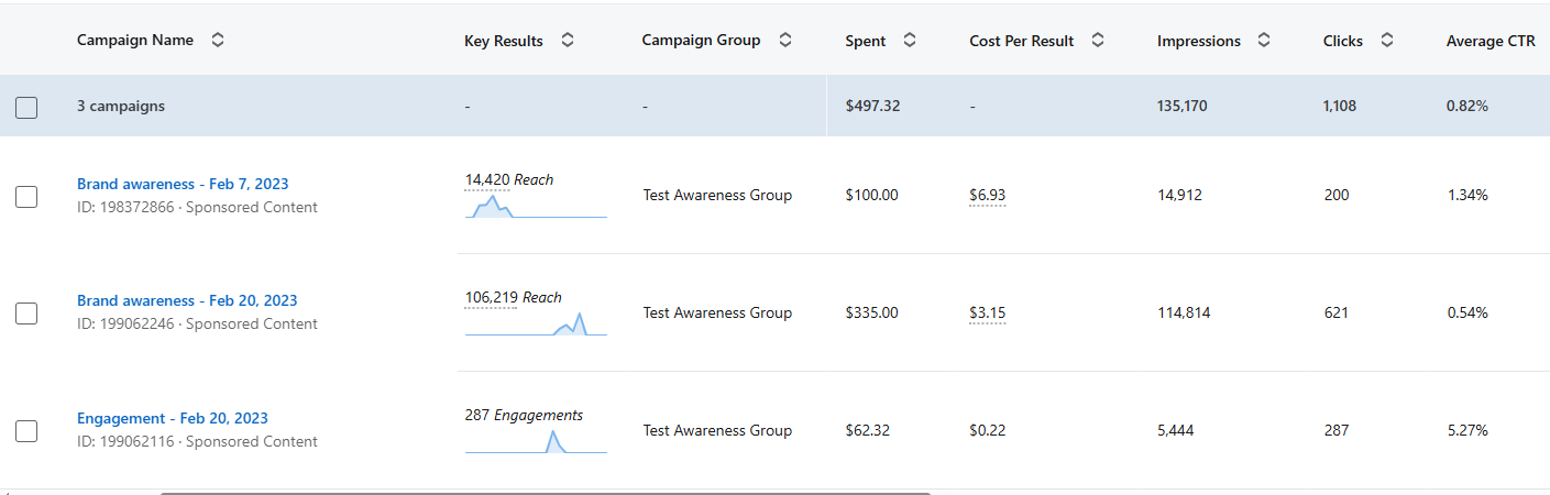
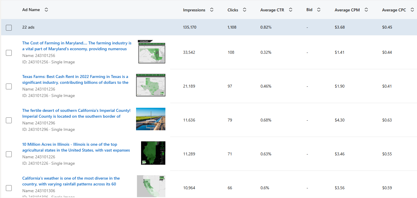
During my marketing campaign, I used these visuals and accompanying articles as posts and ads to attract visitors.
The impact of these efforts is reflected in the traffic results shown below.
After launching the website and establishing a strong foundation, I was accepted into the Microsoft for Startups program.
This provided valuable resources, including advertising credits and discounted access to Microsoft products such as Azure and Power BI Pro.
Below, you can see the Microsoft for Startups badge and the results of my advertising campaigns.
My campaigns reached over 100,000 people and brought thousands of visitors to the site. However, this level of traffic was not sufficient to generate sustainable revenue through subscriptions or advertising.
While the data analytics I provided were valuable to a select audience, the niche market proved challenging to reach at scale.
I firmly believe there are opportunities in specialized markets, but in this case, the audience was simply too small and costly to engage effectively.